How to Build a Personal Dashboard to Track Your Goals and Habits in One View
Set a clear one‑view dashboard objective before you build anything
Your dashboard should quickly answer one question: Am I on track with my personal goals and habits today? Define “on track” in concrete terms, what must be true today (and by week’s end) for you to feel confident you’re pacing toward your outcomes? Keep the surface simple. Hide everything else.
Clarity beats volume. One glance should tell the story.
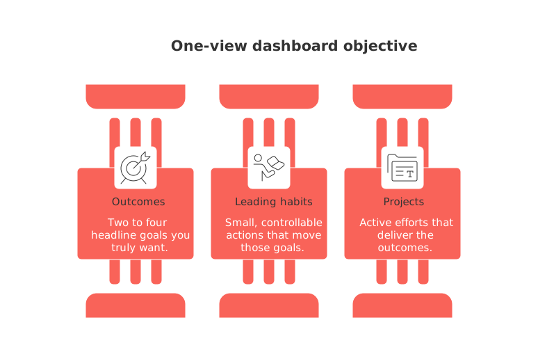
Outcomes: two to four headline goals you truly want.
Leading habits: small, controllable actions that move those goals.
Projects: active efforts that deliver the outcomes.
Choose the right dashboard structure for personal goals and habits
Use modules that match how you think. Mix and match. Keep edges clean.
Core modules to consider
KPI tiles: show weight trend, savings rate, or study hours.
Habit row: streaks and weekly counts, not calendar dates.
Project snapshots: status, next action, and a target finish.
Signal badges: green for pace, yellow for at risk, red for drift, grey for paused.
Focus queue: three tasks that matter most today.
For individuals, start small. Add modules only when you feel blind spots.
Define measurable goals and habit metrics that fit a 12‑week cycle
Short cycles create urgency without burnout. Tie every metric to behavior you control. For deeper framing, see how solo operators use a 12‑week cadence in this 12‑Week Year playbook for solo operators.
Goal: Run a 10K. Metric: weekly distance and one pace test.
Goal: Read 6 books. Metric: pages per day and completion count.
Goal: Save $2,400. Metric: weekly transfer amount.
Habit: Practice Spanish. Metric: minutes practiced and streak length.
Define thresholds now. Decide what counts as on track, at risk, or off track. Make colors match those states.
Pick your dashboard tools and data sources without overcomplicating
Choose one primary workspace suitable to your needs. Notion, Trello, Airtable, or ClickUp are popular choices, each capable of serving as an all‑in‑one hub for your work and personal objectives. Add connections only as needed to centralize tasks and data. Keep imports light. Manual entry works when it is fast and clear.
Health: steps, weight, and workouts from your tracker or app.
Learning: pages read or lessons completed from your reader or LMS.
Money: transfers or savings rate from your bank or budget app.
If you ever switch tools, keep the same metric names. Consistency protects trends.
Design a readable layout with tiles, trackers, and simple signals
Layout drives behavior. Put the most important tiles at the top. Group related modules. Leave white space for breathing room.
Create a top row with two to four outcome KPIs.
Add a habit row with streaks and weekly counts.
Place project snapshots under habits with next actions.
Use a small trend sparkline, not a dense chart.
For visual structure ideas, review lightweight ways to visualize progress with project trackers. Borrow the simplest pattern that fits your goals.
Automate updates and keep friction low
The goal of automation is to reduce manual effort (fewer clicks) and simplify your workflow, not introduce extra rules or procedures. Start with one or two flows. Expand only after they work.
When you log a workout, increment the streak and weekly count.
When a task is done, advance the linked project snapshot.
When savings hit the target, flip the KPI to green for the week.
Test each automation separately to ensure accuracy. Confirm your dashboard updates correctly and reflects your real‑time progress on goals and tasks within a few minutes.
Try this prompt to plan your first version:
You are my dashboard coach. Ask five questions to learn my top goals, habits, and projects. Propose a one‑view layout with 3 KPI tiles, 1 habit row, and 3 project snapshots. Define each metric, its update method, and color thresholds for green, yellow, and red. End with a 7‑day action plan to build and test it.
Run weekly and monthly reviews with tight feedback loops
Reviews keep the system honest. Use the same questions each time. Keep the ritual under 20 minutes.
What moved the headline KPIs this week?
Which habit slipped, and why?
Which project needs a sharper next action?
What will I stop, start, or continue next week?
Lock in learnings. Tweak only one element per cycle to reduce noise.
Use this prompt during your review:
I will paste my weekly metrics and notes. Diagnose why each KPI is green, yellow, or red. Suggest one focused change for the coming week per KPI. Propose a single habit tweak that supports two goals at once. Keep advice specific and measurable.
Adapt the dashboard for family, freelancing, or small teams
Personal dashboards scale well. Share a light version with a partner or client. Keep private metrics separate. For freelance work, mirror client deliverables as project snapshots. Add a simple pipeline row for prospects and active deals. Keep the view readable for non‑technical people.
Rule of thumb: if someone cannot read it in 30 seconds, simplify it.
FAQ
How can I ensure my dashboard is not overloaded with information?
Focus on clarity over quantity. Keep your dashboard simple by concentrating on key metrics that truly matter. Avoid adding unnecessary details that could obscure important information.
What is the benefit of using a 12-week cycle for setting goals?
A 12-week cycle creates urgency and helps prevent burnout, allowing for more focused and intense effort. It provides a clear timeframe for tracking progress and making necessary adjustments quickly.
Why are color-coded signals important on a dashboard?
Color-coded signals offer immediate visual feedback, allowing users to quickly assess their status. Green, yellow, and red indicators help prioritize attention and action based on goal progress.
How can I choose the right tool for my dashboard?
Select a tool that aligns with your workflow and is easy to use, avoiding overcomplication. Popular options like Notion or Trello integrate well with various data sources to centralize your tasks and goals efficiently.
What's the risk of having too many modules on a personal dashboard?
Overloading your dashboard with modules can create confusion and hinder effective decision-making. It's essential to start simple and add modules only when clear blind spots in tracking and measurement appear.
How does automation benefit my dashboard workflow?
Automation reduces manual tasks, minimizing errors and saving time, ensuring your dashboard remains up-to-date with minimal effort. However, over-automation can introduce complications; start small to ensure accuracy and reliability.
Why is it important to maintain consistent metric names when switching tools?
Consistency in metric names prevents confusion and maintains trend accuracy when transitioning between tools. It allows seamless data continuity and ensures users understand metrics even as platforms change.
How can a personal dashboard be adapted for a team setting?
Incorporate shared goals and team projects while keeping private metrics separate. Simplify the display to ensure a quick, clear understanding to accommodate varying levels of technical expertise within the team.

Julien Quintard
Founder & CEO at Routine08/31/2026
